

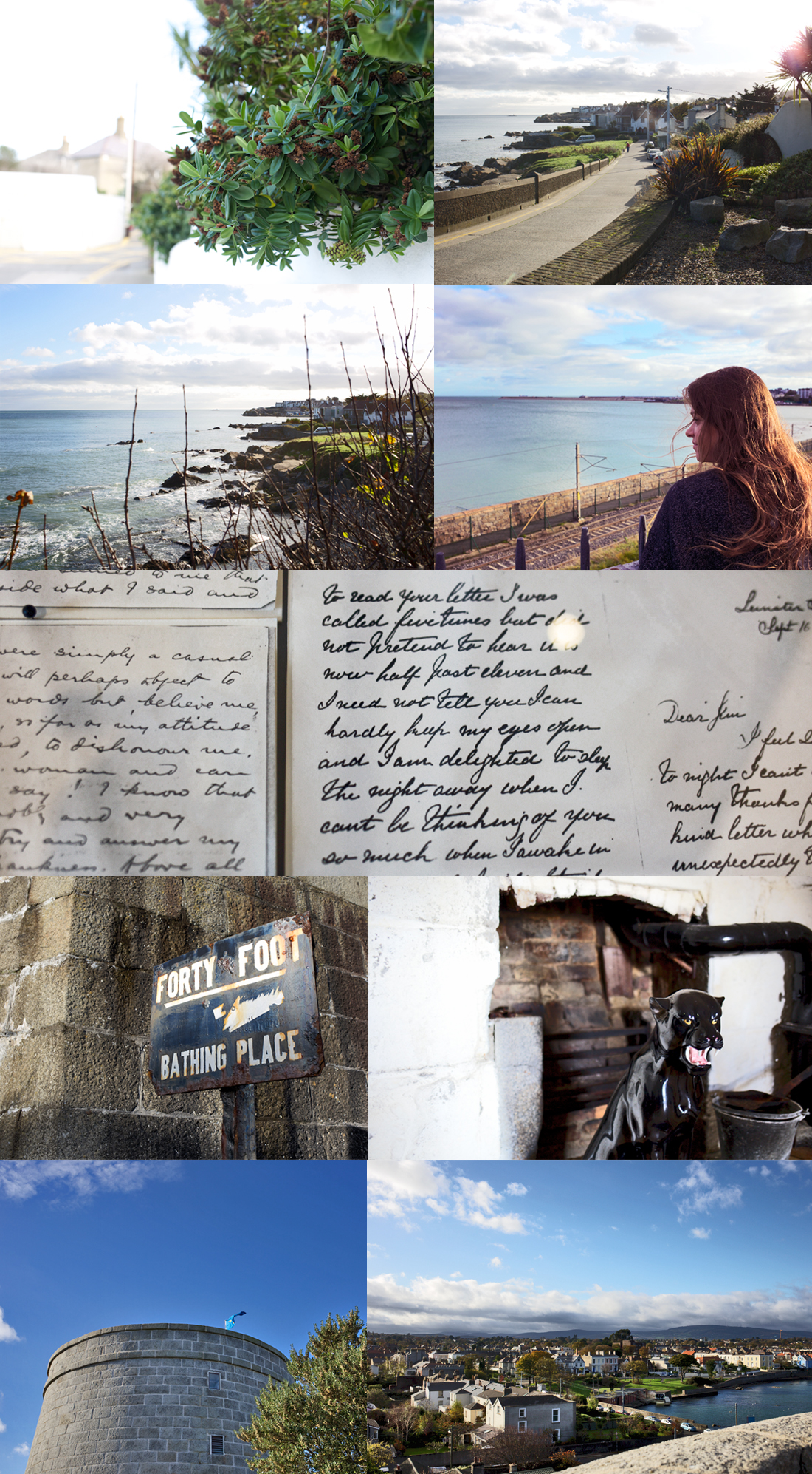
I höst har jag formgett och varit art director i skapandet av en säljfolder tillsammans med Nine Doors Properties. Objekten är fyra stycken helt utsökta, nyproducerade villor ritade av Liljewall Arkitekter i Stureby i Stockholm. Foldern ska på tryck inom kort och villorna ligger reda uppe Hemnet.
Ifall du vill ha mer information eller en folder i brevlådan, maila mig på katarina@lolitas.se
Bilderna är av Nadja Helminen, jag hittade hennes bilder på instagram och blev helt förtrollad. Hur duktig är inte hon på både styling och fotografi? Förresten så har föreningen möjlighet att förfoga över en egen Tesla 3… Villa, elbil och köksbänk i marmor, vad väntar en på?
Såhär kommer foldern se ut på ett ungefär:

Translation
This is a project I’ve been working on as a art director and graphic designer this autumn. It’s a catalogue for a housing project in Stureby in Stockholm, and the apartments (which are currently up on the market) are created by Swedish architecture agency Liljewall and sold by Stockholm based real estater Nine Door Properties.
The text in the infographical presentation above is in Swedish but what it says is basically where on the map the apartments are located, that the kitchen island is built in marble, that they feature a large terrace and that they will be built and ready for moving into into in january 2018.
I found the photographer Nadja Helminen through instagram and I absolutely love her interior styling and photography style. Above are excerpts from the folder itself, along with her photos and a prototype of the finished product. Email me if you’d like a copy of it.


 As I’m currently attending courses in typography and graphic design, I’m suffering from slight tunnel vision which may explain some posters and stuff appearing on Lolitas from now. The calender above is set in the 18th-century font


